
With my team of 2 UX designers and 4 full-stack software developers, we were given 24 hours to tackle the question:
How might we help Wealthsimple clients in Canada improve their financial literacy in order to make better financial decisions?
Outcome
Our solution introduced the addition of a personalized learning experience feature within the Wealthsimple app that encourages the user to increase their financial literacy with personalized articles.
Timeline
Team
2 designers
2 developers
Role
UX designer
UX researcher
Toolkit

RESEARCH
Problem space
As a first step, we conducted secondary research to grasp a better understanding of our problem space.
24%
27%
32%
Assumptions
Based on our secondary research, we assumed that a lack of trust could be a barrier preventing millennials from improving their financial literacy.
One may think, why do I trust an organization to handle my money and give me advice? Do they really have my interests in mind?
Interviews
We ended up conducting one round of interviews with 3 participants between the ages of 24-37 who regularly used a financial service.
Our initial assumptions about trust were invalidated when we found that millennials did trust financial services. They just didn't trust themselves to seek out information.
DEFINE
Narrowing the scope
With insights from our user interviews, we identified an opportunity for design intervention: millennials want to learn about personal finance, but find it an overwhelming subject to approach.
Creating a how-might-we statement helped us focus on user needs and problems, rather than plummet into the pitfall of solution oriented thinking.
Persona
To guide us in our design process and keep us aligned with our true user needs, we created a persona based on our interview insights.
Grace is a busy professional who is interested in improving her financial literacy, but is met with certain barriers.


Grace Davis
“I want to know where to start when it comes to learning about managing my finances. It's so discouraging.”
Job: Receptionist
Age: 32
Location: Toronto
Bio
Grace is a busy professional living in Toronto. She doesn’t know much about finance and has an incredibly busy schedule, finding the task of learning more about finances overwhelming and just another source of stress.
Behaviors
Does not have time to utilize more in-depth means of learning like courses
Motivations
Wants to feel more confident in her financial knowledge and decision making
Would like to know what a smaller amount of money can do when investing
Pain points
Finds it overwhelming to learn about finances
Always feels lost and overwhelmed when she tries to and ends up discouraged, abandoning the process
IDEATE
Storyboarding
Visualizing Grace's current experience helped us identify an opportunity for design intervention.
Grace ends up in an endless loop of searching. Frustrated, she abandons the process.
Designing for Grace
Now that we had a good understanding of where we can offer design intervention, we authored user stories to consider some of the functions and features of a potential solution based on Grace's needs. We then translated them into tasks.
I want to read short, informative write-ups so that I can learn even if I don’t have a lot of time.
Feature:
Offer quick, helpful, bite-sized pieces of information
I want to learn what strategies are realistic to my financial position so that I can set tangible goals.
Feature:
Personalize suggestions for areas of learning to user’s financial position and literacy
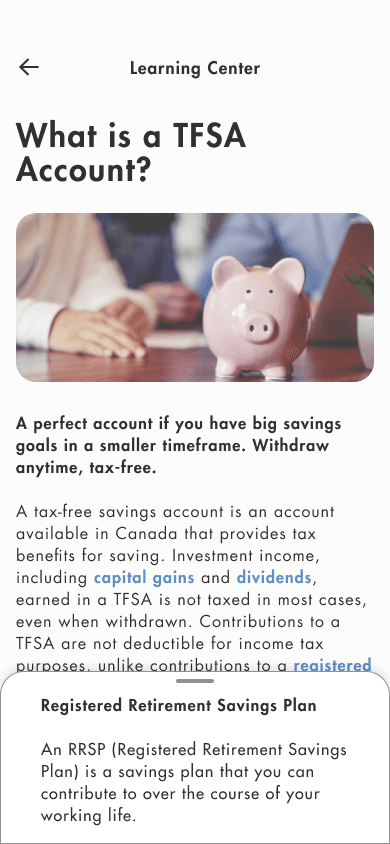
I want to understand financial jargon so that I don’t feel lost when I read educational articles.
Feature:
Help define unfamiliar terms within the app for a seamless experience
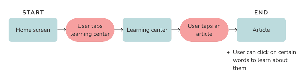
Task flow
Visualizing how content connects in our user flow was an key part of communicating with our developers.
THE SOLUTION
Our solution
With our deadline looming over us, we dove right into hi-fidelity prototyping to give our developers as much time as possible to bring our solution to life.
Communication and transparency with the team at each step of the way was key to streamlining this process, making for a smooth design handoff.


Did we solve the problem?
We think so, yes! Here's how:
We offer help with financial jargon within the page to minimize navigating through a ton of screens and making financial concepts easy to understand in context, breaking the "vicious cycle" pictured in Grace's storyboard.
We offer a quick way to improve financial literacy everyday. Building a routine of reading a short article everyday goes a long way to making this learning task far more digestible.
FUTURE THINKING
Next steps
Our next step would be to user test and validate our solution and iron out any usability issues.
Once the feature goes live, applying analytics to observe engagement is key to gauging the impact of our design.
Learnings
Communication is crucial 🤝
The key was to keep everyone in the loop at all times, delegate, and play smartly into everyone's strengths and weaknesses.
Manage time wisely 🕒
During this project, I had to prioritize tasks effectively and know to discard an idea if it is simply not feasible to complete during the given time frame.
Introspection 💭
I'm a perfectionist to a fault— this project was lesson in compromising and knowing when to let go of ideas in favor of moving forward.