
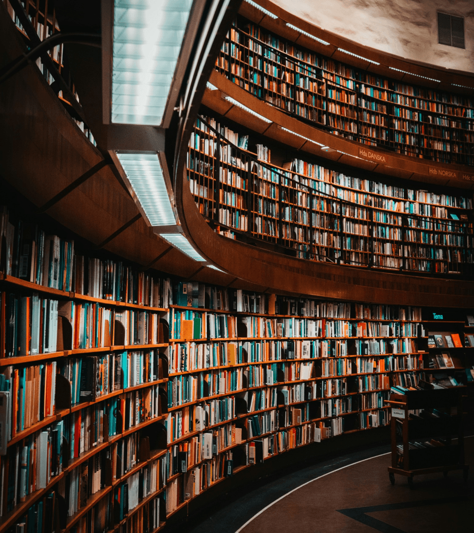
Libraries have a wealth of events and services that are severely underutilized due to the frustrating nature of current channels of discovery.
Outcome
Novel is an event discovery app that streamlines the process of finding events and book clubs at local libraries.
Timeline
Team
Sole designer
Role
UX designer
UX researcher
Toolkit


DISCOVERY
Problem space
Libraries are universally seen as cornerstones of educational, cultural, and social value. However, their services are underutilized by the same population holding these values. Why?
94% of the population agree that having a public library greatly improves the quality of life in a community.
However, 78% are not fully aware of the services offered at libraries.
Assumption:
Due to lack of online presence, libraries have struggled to "catch up" as we advance to primarily online channels of discovery.
Interviews
I ended up conducting one round of interviews with 3 participants living in Toronto who used a public library in the past year. I organized my findings into user behaviors, motivations, and pain points.

I know there's so much going on at the library, but I'm not sure how to find out about it.
When it comes to libraries, I can never find what I'm looking for online.
To find out about events, I guess I would have to go to the library and ask in person.
Key insights 🔍
As it turns out, my assumptions were only half right. While it was true that library goers were unaware of many services due to lack of online presence, many of my interviewees did know about events.
Library goers struggled with:
Frustrating sign-up experience
Due to the frustrating nature of the online discovery and sign-up experience, Library goers often abandon the process.
Difficulty finding information
Library goers are undersure of how to get more information aside from asking in-person.
DEFINE
Defining a HMW
The insights from my interviews helped me identify an opportunity for design intervention:
Library goers wanted to discover and attend library events, but current channels were frustrating to navigate.
How might we help library goers discover events at their local libraries so that they can stay connected and involved with others in their community?
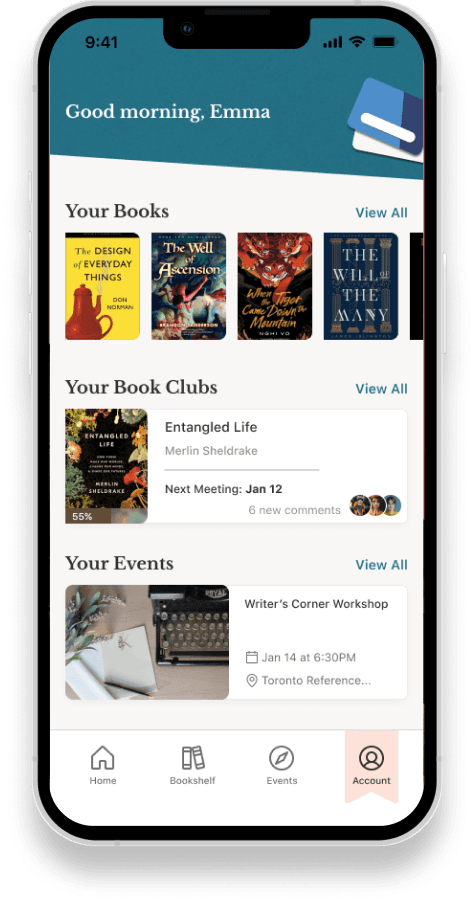
Persona
Now that I had a direction in mind, creating a persona helped ensure that my solution aligns with the needs of my target users. Emma reflects insights I found during my interviews. From here on out, Emma is my north star in each and every design decision.

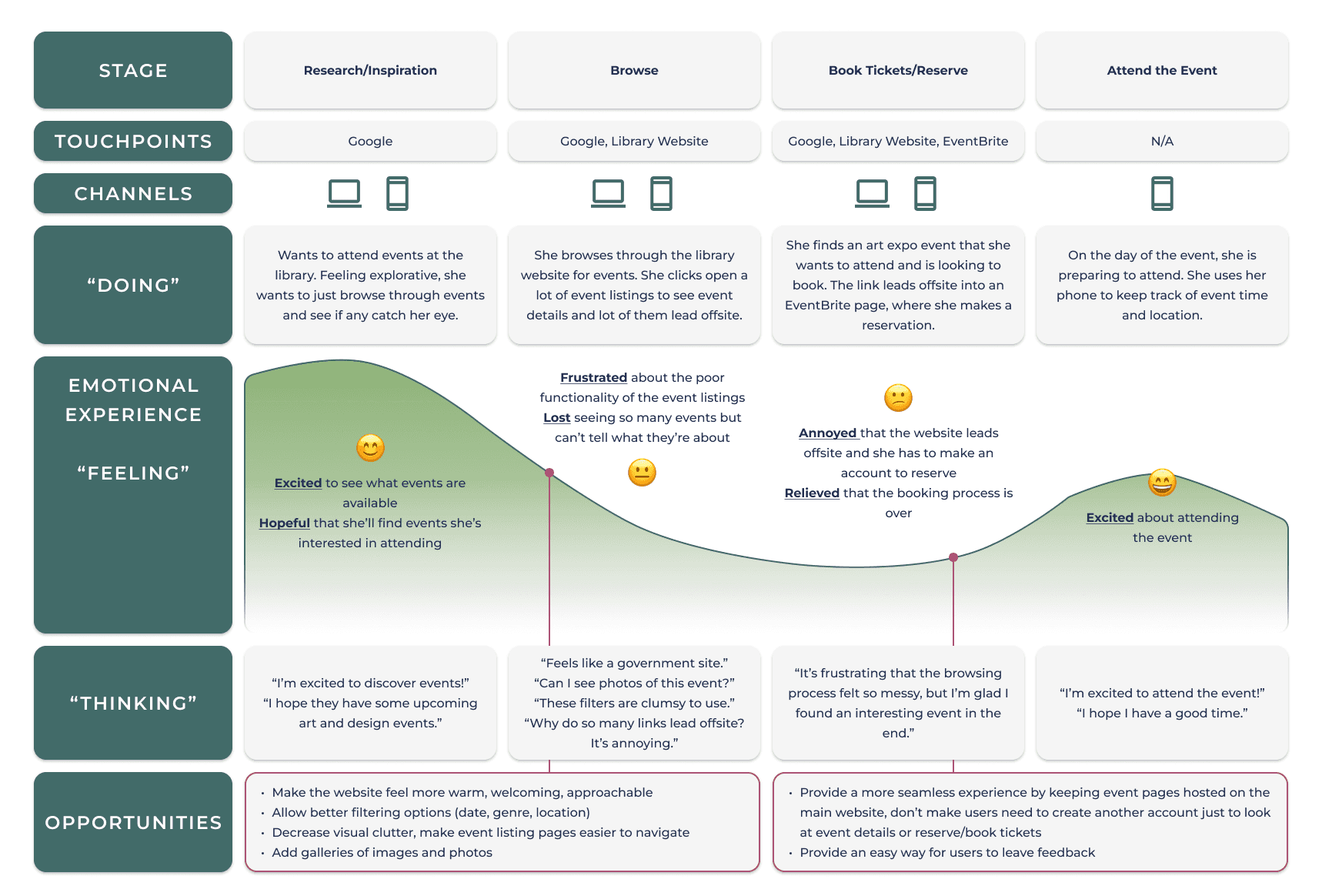
Experience mapping
With the creation of a persona, I used an experience map to understand how Emma would feel throughout her journey in order to identity possible avenues of design intervention.
User stories
Authoring user stories allowed me to visualize the needs of my users from a functional perspective.
The user stories I created were grouped into 6 epics.
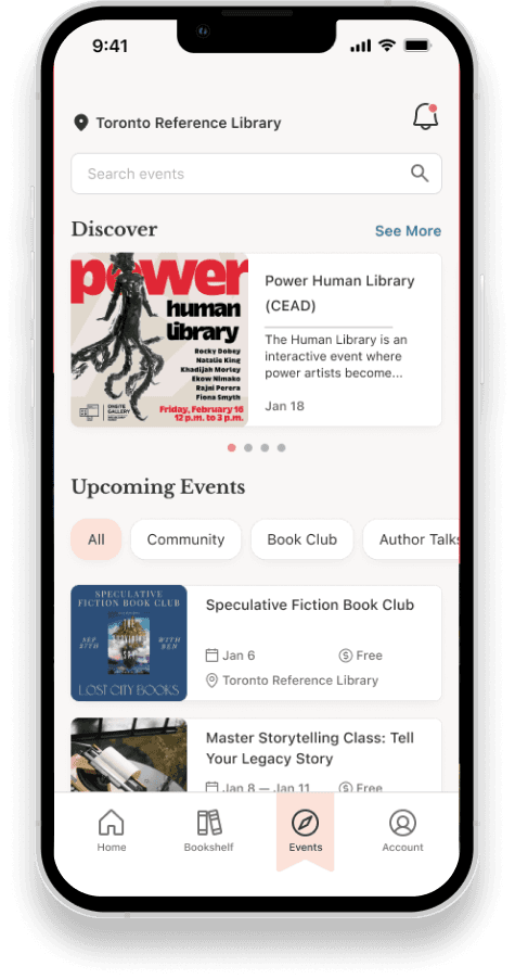
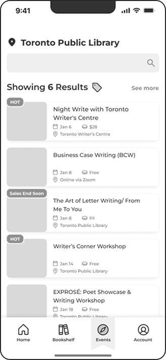
Key epic 💡 browsing events
The epic I chose to move forward with was browsing events as it closely relates back to my key insight of event discovery, and therefore best addresses Emma's needs.
User stories
Task
I want to easily browse upcoming events at my local library so that I can plan my visits around activities that interest me
browse events
I want to sort events by free or paid so that I can find events for my preferred price point
sort by price
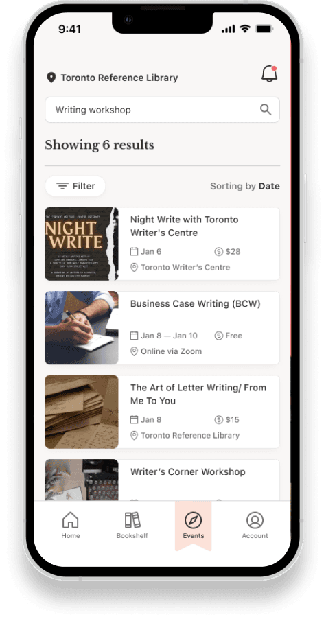
I want to search for events by keyword or tag so that I can quickly find activities related to specific topics
search by keyword
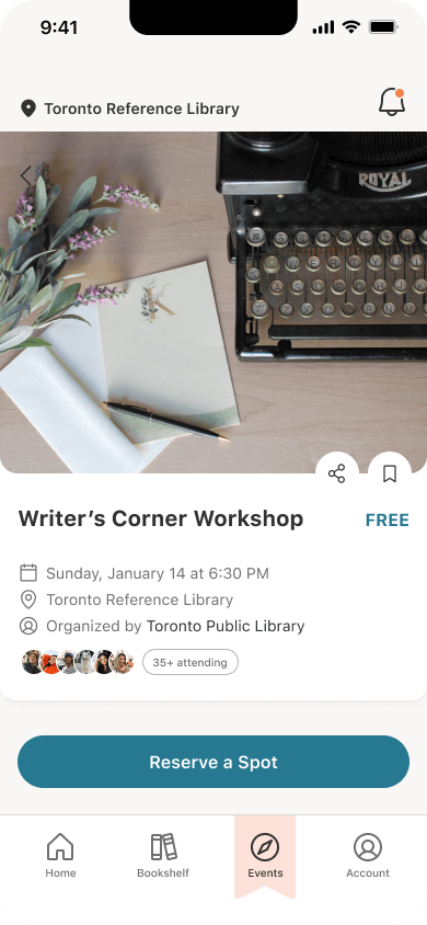
I want to see how many people are attending an upcoming event so that I can gauge the popularity of activities
view attendee count
I want to receive personalized recommendations of events based on my preferences so that I can discover activities and resources tailored to my interests
view recommended events
I want to sign up for events so that I can reserve my spot at events I'm interested in
sign up for events
I want to see when events are scheduled for so I can prepare for attending on time
view event time
Task flow
A task flow diagram presents my user's journey when discovering an event and reserving a spot.

Sketching exploration
I iterated through at least 3 exploratory designs for each screen, analyzing pros and cons before finally choosing a design that most effectively addressed Emma's needs.
Since my users are library goers, I wanted to make sure my app provided information in a way that is accessible not only to Emma, but to a diverse community. This meant using clean and understandable interfaces.


MID-FIDELITY
Mid-fidelity
I compiled my solution sketches and turned them into grayscale wireframes. Once I added interaction to my wireframes, I had my first testable prototype. Not the prettiest looking, but purposefully so as to place all the focus on the user experience. It was time to test my design with real users.


USABILITY TESTING
Usability testing
I ended up conducting 2 rounds of 5 individual user tests to gain insight on where usability can be improved. In the first round of testing, a major usability issue in the search task revealed itself.
AT
✅
❌
✅
✅
✅
ZH
✅
✅
✅
✅
✅
JC
✅
✅
✅
✅
✅
WW
✅
✅
✅
✅
✅
LF
✅
❌
✅
✅
✅
5/5
5/5
5/5
5/5
5/5
What went wrong?
I assumed that it would be intuitive for my user to tap the search icon, simultaneously applying the filters and finalizing the search. This assumption was invalidated by 2 of 5 testers who experienced confusion with finalizing the search and navigating to the search results.
Why did this happen?
While this pattern aligned with my own experiences, mental models are not universal. For the other 2 testers, they had no idea at all how to proceed, trying a myriad of alternate options. This experience really highlighted the value of conducting user research and reiteration. A design choice that was a no-brainer to me was something that 40% of users actually disagreed with.


Fixing the problem 🔧
I went ahead and implemented a CTA at the bottom of the tags that was separate from finalizing the search.
This addressed the problem with my second round of user testing being a smooth 100% task completion.
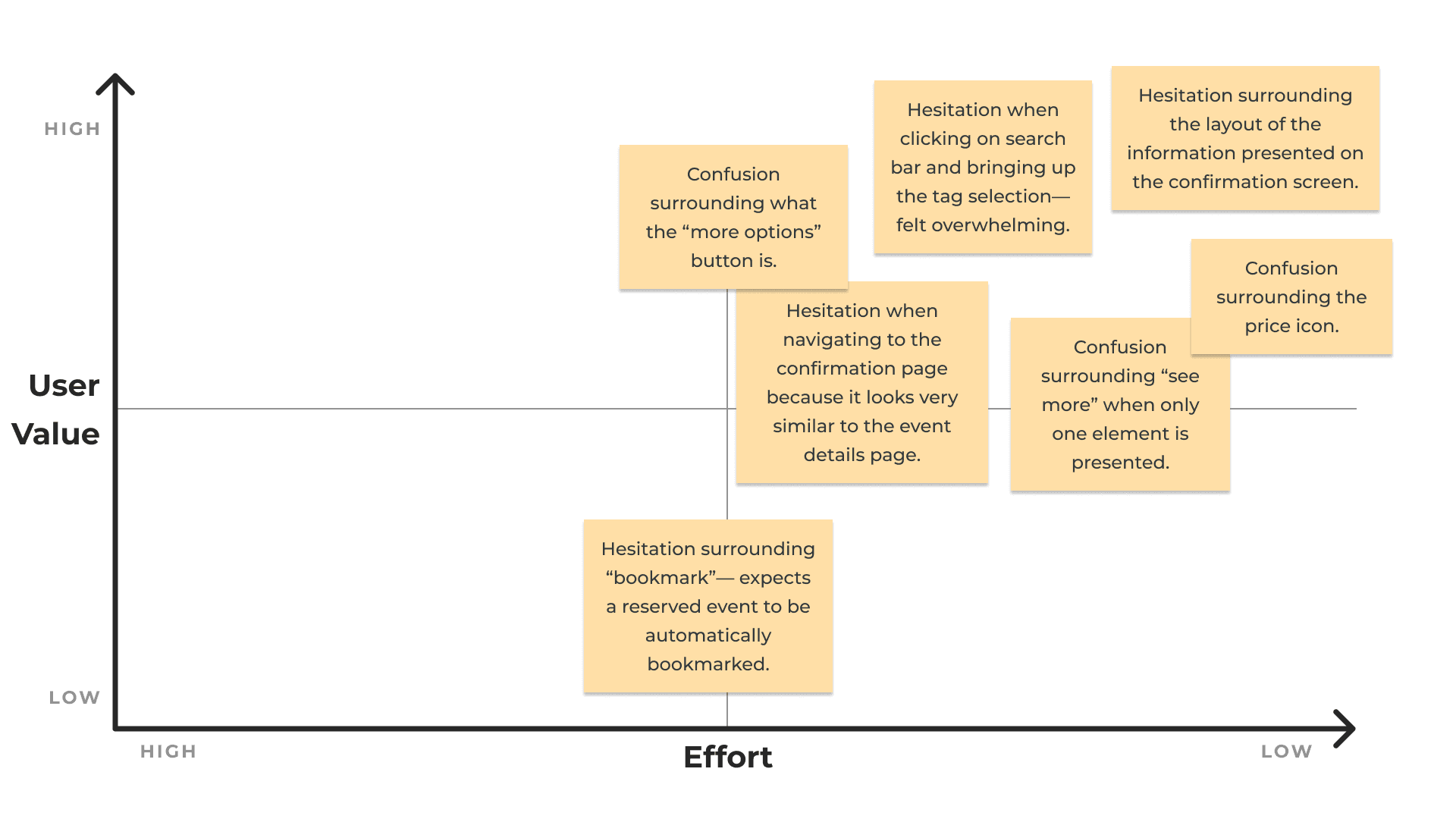
Prioritization matrix
Outside of my main task flow, my user tests identified many other opportunities for usability improvement. Give the time constraints, I used a design prioritization matrix for each round of user testing to pinpoint the highest-priority issues.
Measuring user value against effort allowed me to prioritize solving problems that had the most significant impact on usability while simultaneously requiring less effort.
Implementing changes
With the prioritization matrix to guide me, I implemented changes to address the usability problems I identified. I present my major revisions below, showcasing the initial prototype and the 3rd (final) iteration.
Before
After

Selection transparency
I displayed the selected tags in the search results and added sort filters for date and price.
Before
After

Home page
I changed the book section header to “your books” to give the home screen a more personalized feel.
I also removed book info— the book covers are indicative enough if it's the user's own books.
Before

After

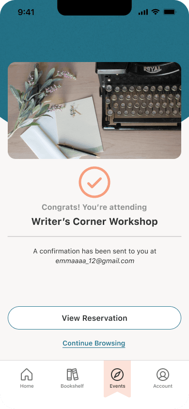
Confirmation screen
I made the confirmation page feel more impactful, adding a checkmark and confirmation message.
VISUAL IDENTITY
Brand development
I extracted a variety of colors from my mood board to develop a primary brand color. Teal in particular encapsulates both the calmness of blue and the harmony of green, providing a relaxing and serene hue.
Novel is cozy, relaxing, nostalgic, and inviting. To play into the nostalgia aspect, I went with warm, muted colors for a more vintage ambience. I really leaned into the paper textures!

Brand colors
Extracted colors
Type and color
I went with the timeless combination of serif and sans serif for my font to preserve a bookish feeling while simultaneously allowing for a clean and readable interface.


Design system
A design system helps standardize design, upholding consistency and optimizing workflow when creating new designs. It also helps compile all the gritty details for a smooth design handoff.
While a complete design system consists of more aspects such as design principles and code components, for this project I focused solely on creating a user interface library, following the principles of atomic design.
HIGH-FIDELITY
High-fidelity
Once I created my visual identity, it was time to implement the branding into my prototype. My final designs took a lot of tweaking, with iteration upon iteration, but finally I had a working prototype that I was satisfied with.
Go ahead, try it out!


Promoting Novel
To showcase my app to prospective customers, I created a marketing website. Having a strong website is an invaluable tool for establishing the legitimacy and credibility of a service.
I designed an adaptive website with two breakpoints, desktop (960px+) and mobile (320px+).


DESIGN IMPACT
Solving the problem
Novel provides a way to streamline discovery and reservation of library events.
This effectively addresses the problem of library event discovery not having a centralized platform, causing frustration due to the clumsy user experience of having to hop between multiple sites.
Novel would help library goers find more delight in their library experience, and form valuable connections in their local community.
FUTURE THINKING
Next steps
In 2023, the Toronto Public Library annual survey saw about 350,000 program attendance of programs and events. To measure success with its hypothetical release, I would like to see a 15% increase for 2024 with usage of Novel to signify its usage and engagement.
I would also like to implement more accessibility considerations for the diverse userbase of public libraries, accounting for factors such as additional language support and motor disabilities.
Learnings 💡
Research— more is better!
I found major usability problems in the second round of user testing that I would've missed completely, had I not conducted the additional tests.
Learn from other designs
Certain aspects of effective design are already well established, and there's something to be learned from everyone.
Don't get attached
Sometimes, a better solution comes to light only after a complete pivot. An important lesson for me was learning when to let go.
© Coco Wang 2025