
Crisis Text Line (CTL) is a global nonprofit organization providing free and confidential mental health support and crisis intervention. In Canada, services are provided exclusively over text.
I was a volunteer crisis counselor for two years. During my experience here, I've recognized my passion in advocating for mental health, as well as the idea that certain challenges faced by CTL can potentially be solved with design.
In this case study, I propose a solution to address the long-standing problem of user abandonment during to long queue times.
Role
Product designer
Timeline
4 weeks, March 2024
RESEARCH
Problem space
I looked at two studies [1] [2] of user experiences with CTL to identify challenges when it comes to providing their services.
86%
86% of texters expressed that their conversation was helpful, and that they felt more hopeful afterwards
22%
22% of texters described problems with how services are delivered, resulting in reduced accessibility or potential harm
21%
21% reported long wait times to reach a counsellor, making this the most common concern among users
Interviews
To better understand how texters interact with CTL services, I conducted multiple semi-structured user interviews. While many express the helpfulness of CTL services, they also highlight the long wait times and the anxiety-inducing uncertainty that comes with it.
"I have had good experiences with 741741 text line. It helped me off the ledge and that was what I needed in the moment."
"It was also cathartic— at least briefly— to be able to say to someone how shitty this year has been without having to be that vulnerable with a friend."
"I never know how long I need to wait for. The first time I waited for 30 minutes and then gave up. The second time, it only took 5 minutes."
"I texted 741741 and no one responded after 30 minutes. I said never mind. Honestly made me more depressed than I already was."
KEY OPPORTUNITIES
Understanding the current experience
1
Preference for text
There is indication of user preference for texting over phone calls during moments of crisis.
2
Technological barriers
Technological barriers can include lack of phone or cell service, as well as unsupported carriers.
4
Uncertainty during wait time
A complete lack of feedback on wait time is disheartening. With each passing moment, texters must decide between leaving and staying.
3
Long wait times
Sometimes, by the time a crisis counselor connects, the crisis is already over. Texters also abandon the process if it takes too long.
Personas
I ending up creating two personas based on my research findings, representing two distinct user groups that interact with CTL services. This allowed me to better understand my target users and make well informed decisions in my designs.


IDEATE
Design considerations
The two types of users navigate the app in different ways, and it's important to make sure both are catered to. Creating user stories allowed me to explore functional solutions that address these needs.
Thomas:
I want to see how long I have to wait so that I can feel reassured that I will be seen to.
Feature
Display feedback on wait time/queue
Thomas:
I want to be recommended mental health resources so that I can read them during long wait times.
Feature
Provide support resources using geolocation information
Jane:
I want to know that I will quickly connect with a crisis counselor in a moment of crisis so that I can receive the support that I need.
Feature
Display feedback on wait time/queue (especially vital in high risk situations when a texter has been moved up in the queue)
Task flow
I then created what might be the shortest possible task flow diagram ever— a positive characteristic, as our product wants to streamline the singular goal of connecting the user with a Crisis Counselor as much as possible.
Home
User taps chat CTA
Chat window
user can see the estimated wait time in the home screen and chat window
When a crisis counsellor is available, user will be alerted
Iterate, iterate, iterate
For the home screen, primary areas of concern were ease of use and simplicity. I focused on three core aspects.
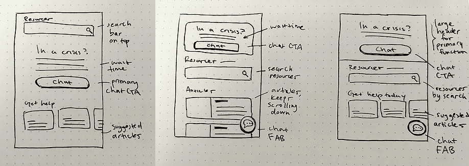
1
Call to action
Users might still be hesitant on whether they want to use the service. We want to gently nudge them into connecting.
2
Stay on the line
We don't want to leave the user in uncertainty. We want to reassure them that support is coming by showing estimated wait time.
Long wait time is the most important point of conversion.
3
Geolocational resources
This is helpful to more resource receptive users like Thomas who are looking for actionable suggestions.
THE SOLUTION
My solution

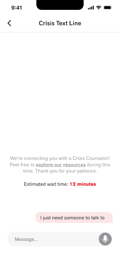

Design impact
Transparency of queue time alleviates the stress of wait time uncertainty, a key pain point for CTL users. This simple solution would greatly decrease the abandon rate during waiting, providing more Canadians in crisis with the support they deserve.
FUTURE THINKING
Next steps
Based on findings in previous studies of CTL texter behavior (21% dissatisfaction with wait times), I would like to see a 15% decrease in abandon rate during the wait process to demonstrate the impact of this new feature in a hypothetical implementation.
Next steps would be to conduct user testing and iron out any usability issues. Once implemented, the effectiveness of my solution can easily be tested by measuring abandon rate, either with A/B testing or by comparing to previous results.