

Alley-oop 🏀 is a multi-theme, multi-brand design system housing the foundations that facilitate beautiful, consistent, and accessible experiences across theScore BET platforms.
During my internship at theScore BET, I was given the opportunity to spearhead the development of the design system's brand new documentation site.

Timeline
Team
DISCOVERY
Understanding our users
To gather insights about how feature designers and engineers interacted with our design system, I conducted a survey at the beginning of this project. I finalized a set of 10 questions and analyzed responses from feature designers across 4 different teams.
Key insight 🔍 … poor documentation
Lack of usage documentation
The design systems team would often get clarifying questions about certain components.
Theming
There was confusion about how certain components and tokens behaved across theme and device changes.
General uncertainty
Designers were unsure of where to seek information regarding specific questions or topics.
But we have documentation!
However, a significant amount was unorganized or outdated. Documentation cannot be an afterthought. Poor documentation is often not much better than no documentation, because it simply won't be used.
Figma
Loom
Confluence
Documentation was spread across many platforms.


Existing documentation was difficult to navigate.
Defining success
Based on our findings from our user research and stakeholder expectations, we more narrowly defined several objectives so we're able to measure success. This helped us proceed to ideation in clear alignment with our goals.
1
Designers and developers feel that they have a better understanding of our design system
2
It's easier to find information, guidelines, and documentation related to Alley-oop
3
Alley-oop has smoother and more intuitive onboarding for designers and developers
4
All tokens and components housed by Alley-oop can be shown at the theme level
IDEATE
Supernova!
We endearingly named our project Supernova, simply after the design system platform we utilized. During the following month, I had the unique pleasure of watching our documentation site come together, not unlike the formation of a new star— a bit ironic!
Competitive analysis
Throughout Supernova, I conducted audits on dozens of existing design systems. Since a documentation website was uncharted territory for me and much of my team, we sought much inspiration from industry exemplars. Some of my favourite design systems were…

Carbon for IBM
Great integration of code snippets, amazing accessibility guidelines.

Duet for LocalTapiola
Intuitive token switcher between two distinct themes.

Workbench for Gusto
Fantastic usage examples and navigational hierarchy, good vibes!
Navigational hierarchy
We iterated through many models of navigational hierarchy at a holistic level and for individual sections.
I ensured that inclusive and accessible design lived near the core of our design philosophy by iterating through structures of presenting WCAG 2.0 principles and guidelines in our documentation.


Creating content for Supernova
After cataloguing user insights, competitive analysis, and locking down our navigational hierarchy for the MVP, I dove into hi-fidelity. When designing pages for Alley-oop, there were certain key concepts I internalized to the point of second nature.
Searchability
The way content is laid out must be consistent, and all content must be searchable.
Concision
When it comes to documentation, use minimal space and content to convey maximum meaning.
Scalability
I designed content on Supernova to evolve alongside the growth of the Alley-oop design system.
Constant feedback and collaboration was vital at every step of the way. It was important for us to stay informed about what our design partners on feature teams were working on so that we can strategically approach the content in our site.
I noticed that when displayed against our light color palette, dark themed "best practices" cards gave the illusion of a section divider. It's easy to mentally fill in the negative space between the black rectangles— a behavior that can be attributed to the Gestalt law of closure.
Switching into a light version of the "best practices" cards solved this problem, allowing the visual focus to return to our headings.
❌ Dark themed "best practices" cards
Can be mistaken for a divider when scanning
✔️ Light themed "best practices" cards
Does not steal visual weight from other elements
LAUNCH 🚀
Key deliverables

User research
I planned and conducted a survey to gather user insights across 4 feature teams and presenting the findings.


20+ new icons
I contributed icons and documentation to Alley-oop as part of the icon redraw project.

10+ unique pages
I spearheaded design direction, copy, and graphics for content in the Alley-oop documentation site.
Foundations
I created the introductory page for our foundations section, breaking down Alley-oop's robust design token and theming structure in a digestible way for designers and developers.
ESPN and theScore offer a range of products across 4 themes and 3 platforms. Ensuring that our users are able to understand and navigate this environment is mandatory.
#00755E
espn/green/70
color/border/success


Color tokens
I designed the overview and usage guidelines for our color tokens, addressing important aspects such as brand color anatomy, WCAG contrast ratios, and usage best practices.
I conducted an audit on how we use our ESPN color tokens across its two themes, creating sets of ideal color pairings that integrate smoothly into the existing design system.

Accessibility
Accessibility standards were not yet set in stone for the Alley-oop design system. I took this opportunity to research and advocate for the importance of good accessibility documentation.
I created the primary accessibility section from scratch, researching and documenting design philosophy and principles to ensure an inclusive experience for all users navigating through our products.


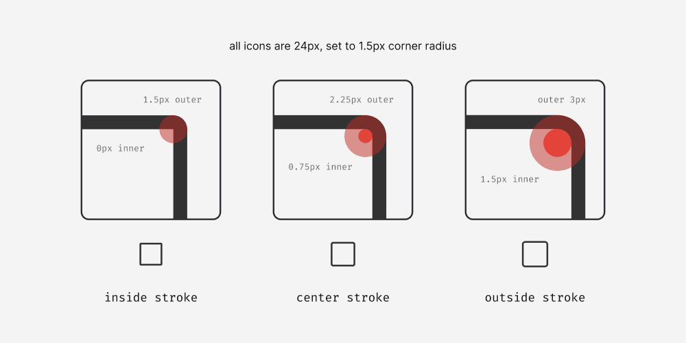
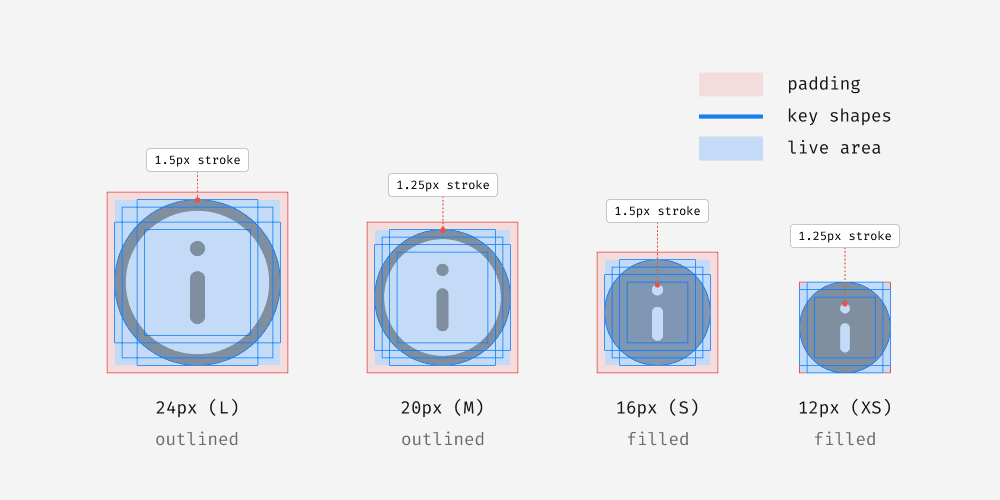
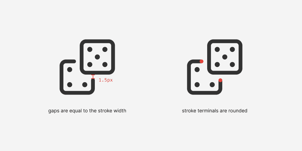
Iconography
I created documentation for icon overview and usage, covering best practices, accessibility considerations, and more.
During my time at theScore, I was also heavily involved in the icon redraw project in an effort to establish icon standards across the design system. I created the documentation page for the design guidelines of new icon creation to ensure consistency for future additions to Alley-oop.
I personally designed 20 icons for our design system, and contributed to many more. As a team of three, we completed 41 icons over the span of my internship.


I ended up creating 45 graphics for the icon design guidelines page alone. The icon redraw project was also my first deep dive into iconography so it was an exciting challenge to learn, design icons, and later document all in the same breath.


Theme bundling
A goal of Supernova was to display all tokens and components from the Alley-oop design system at the theme level.
We migrated our 300+ existing tokens into the new documentation website. With Supernova, finding and referencing specific design tokens is far more efficient. A tab system allows for easy switching between themes, and tokens are searchable.

Changelog & FAQ
I set up the changelog in preparation for future updates to Alley-oop. I migrated our existing FAQ from Confluence, edited the content for clarity, and made several additions based on the findings from our user research.


A stellar explosion!
The Alley-oop documentation site launched on the last day of my internship! Launch was smooth, and we met every MVP objective.

Design impact
Good documentation proves exceedingly valuable when it comes to improving workflow efficiency, a universal pattern observed time and time again with comprehensive research. A single source of truth saves time and provides a valuable sense of security.
Our new icon system and documentation website decreased inquiries about icon locations by 64%
FUTURE THINKING
Measuring impact
Conducting another round of surveys with feature designers and developers was in our plans. We can then compare the new findings against our initial research.
Our initial survey found an average score of 7.2 when rating the usability of Alley-oop across 11 designers.
An increase of 2 is our target average for the next survey.
Validating our design
During my last week, I started ideating a set of questions for usability testing, sorted into four main categories: user satisfaction, content quality, usability, and branding. Demographic data would also be recorded to observe if there are noticeable trends when paired against our previous survey research.
Learnings
Communication is key 🤝
Being a good communicator is half the job. I greatly refined these skills during my time here.
Perfectionism can be a trap 🕒
Perfectionism must be balanced with priorities. I improved with advice from my mentors as well as iterating upon my work process.
A new passion! ❤️
I love design systems! I had the pleasure of learning this about myself during my experience at theScore.